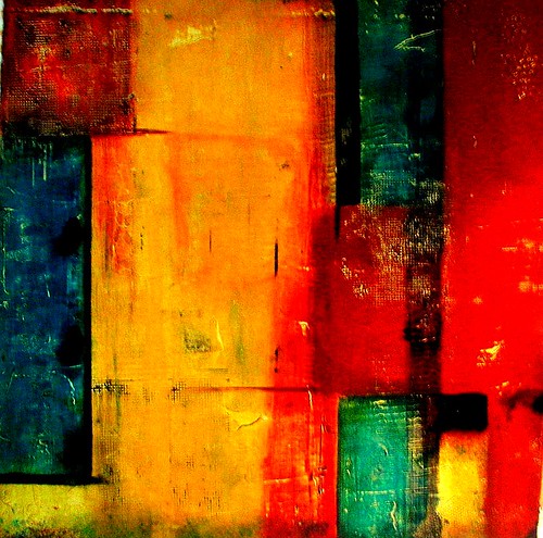
Someone Wanted Happy, 30 x 30", mixed media & acrylic on canvas
A person who should know told me that paintings with happy bright colors (especially red) sell best. Looking through my latest work, nothing struck me as particularly happy-looking. So in this painting I used the happiest colors I could think of, but I still couldn't resist grunging it up a bit. Even the black isn't black, it's Payne's gray. This photo doesn't show it well, but down in the lower right hand corner is a textured and colored area that I love. It looks good against the black background of the blog, doesn't it? I like happy.


.jpg)


1 comment:
Perfect combination of happy and distressed!
Post a Comment